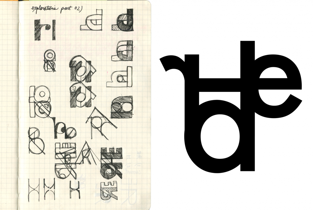
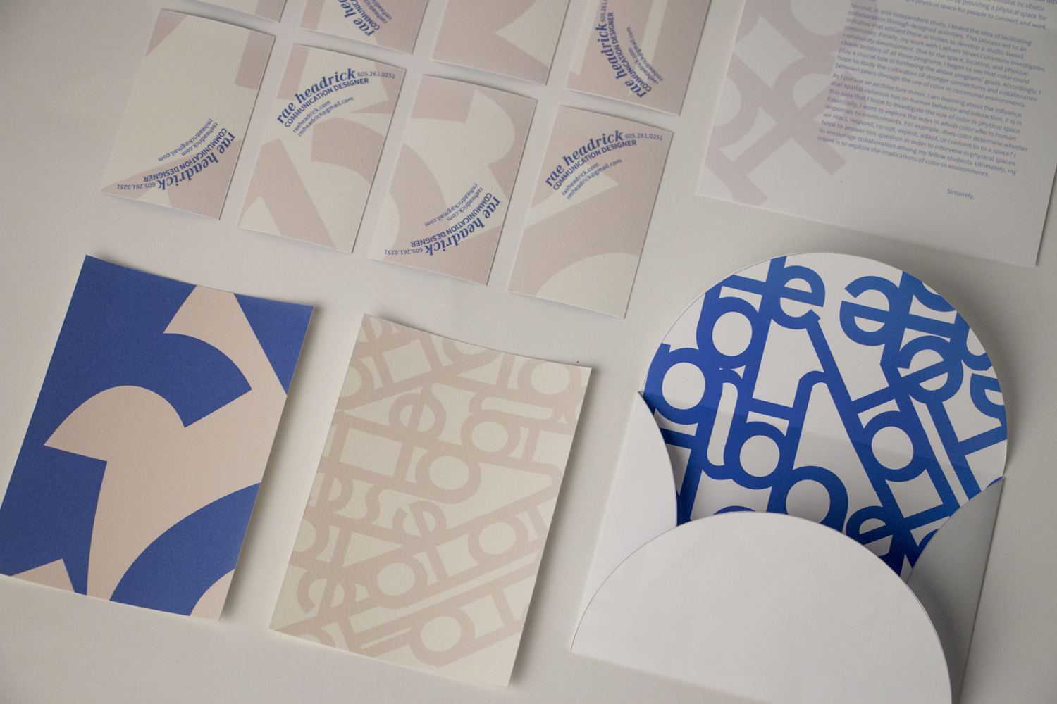
Word Mark
From the beginning I was deeply inspired by simple geometries and hard edges that can build and play off of each other through overlap and joints. The idea to cut and collage the letters of my initials also greatly impacted my final design. Based on these two inspirations, I chose the typeface Futura to construct my word-mark. For a while I struggled to resolve the harsh edges of Futura’s capital letters, and my focus was misaligned as I spent much of my time designing an expressive word-mark verses one that could create an expressive type composition in the next phase of the project.
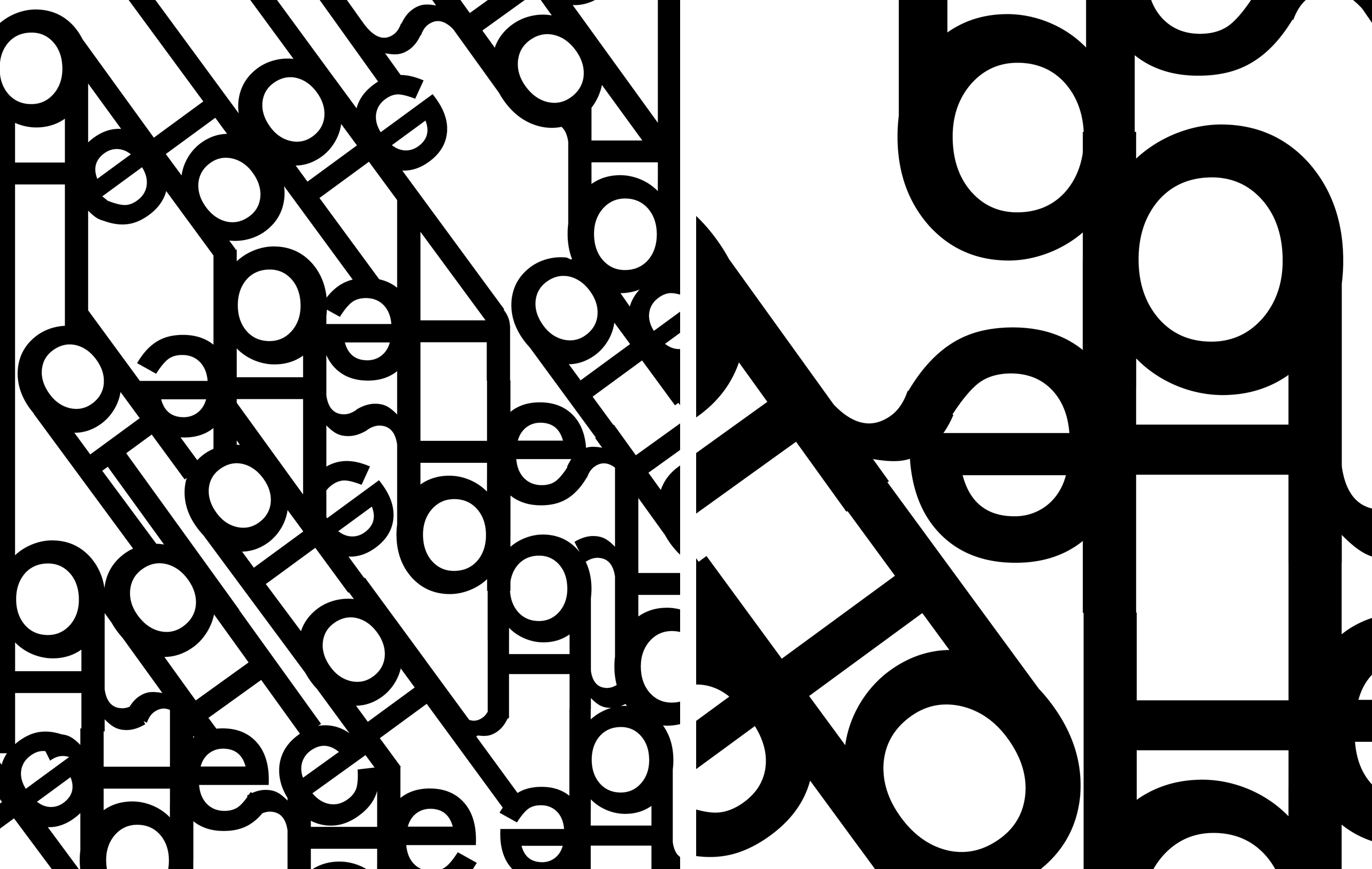
Typographic Composition
The final composition was created by overlapping the (white) negative spaces of 2-3 repeated word-marks onto one enlarged (black) word mark that sat in the background. A big part of the challenge was to arrange the pieces so that there was a clear background, middle-ground, and foreground as opposed to a composition that is flat. As I began to fall in love with the juxtaposition of hard edge and curve I realized that the ratio of negative and positive space was my key to a dynamic composition.
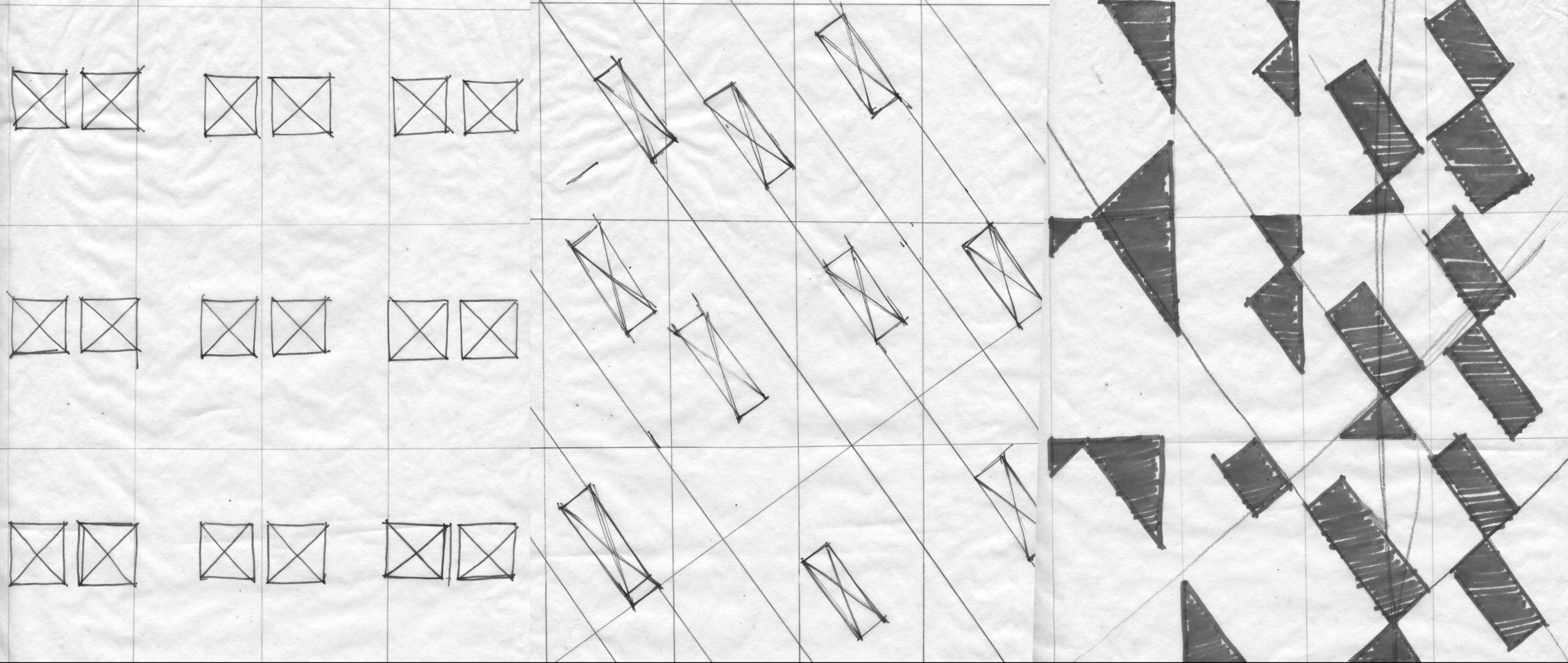
Grids
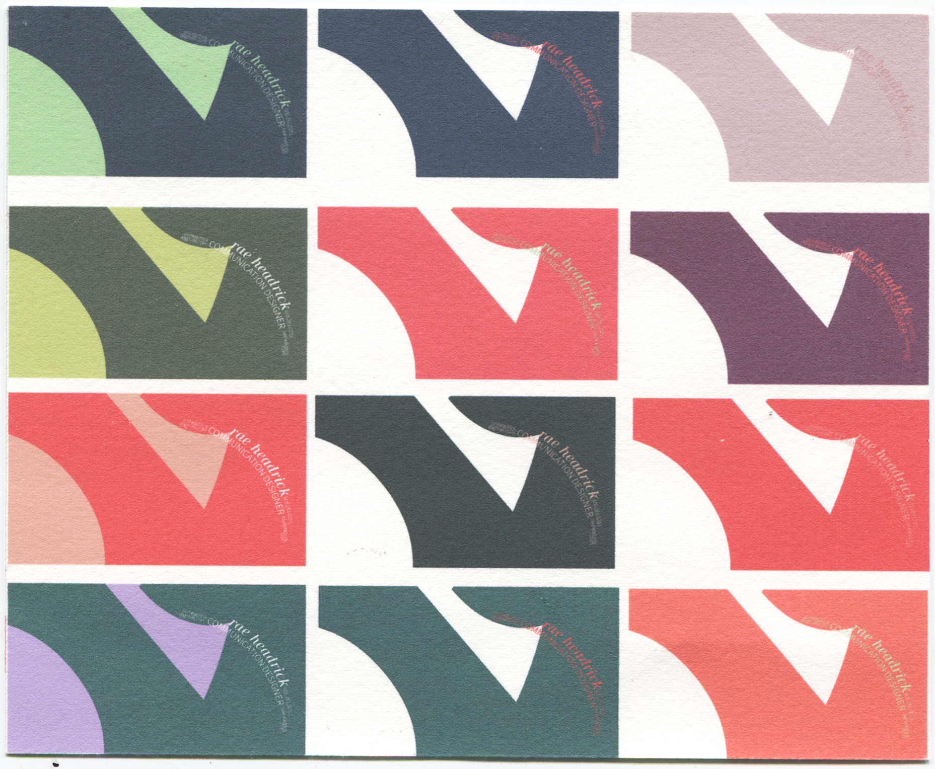
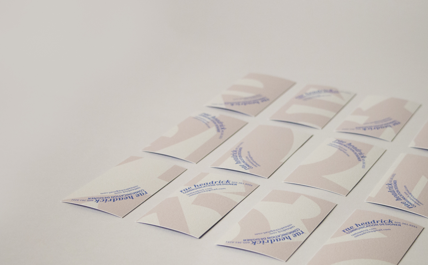
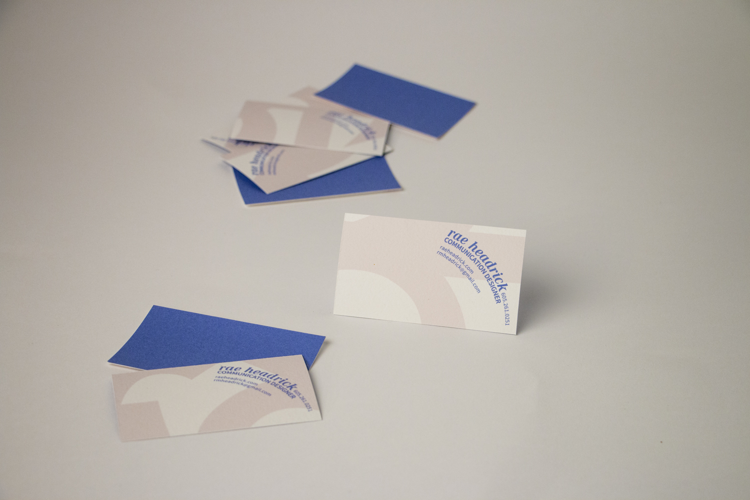
After learning about several different varieties of grids during class and tracing out a modular, symmetrical, and diagonal one onto my piece, I did one final exploration of a radial grid and loved it. The way type set on a curve lead my eye to interesting parts of the background composition. I based the radial grid, first, on an inferred circular sub-dominant motion within my composition. However, after setting the content within each business card, this grid didn’t allow for enough space to read my name, number, etc. I then changed the grid to keep with a radial type setting but arranged the curves differently.